
So you need to switch to Jeppesen plates? There are a variety of reasons why you would need to switch. Whatever the reason, switching to different plates is a pain at first.
Don’t worry, though, the information is the same, it’s just located in different places.
I am not here to argue which is better. I have used both extensively for my job with an airline and for the military.
They both have their ups and downs.
This article will cover the differences in Standard Instrument Departures (SIDs).
I have already discussed the differences in Airport Diagrams in Part 1 and I covered Approach Plates in Part 2.
STANDARD INSTRUMENT DEPARTURES
Let’s start with some examples. Take a second to digest the different plates.
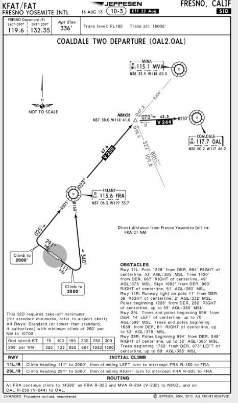
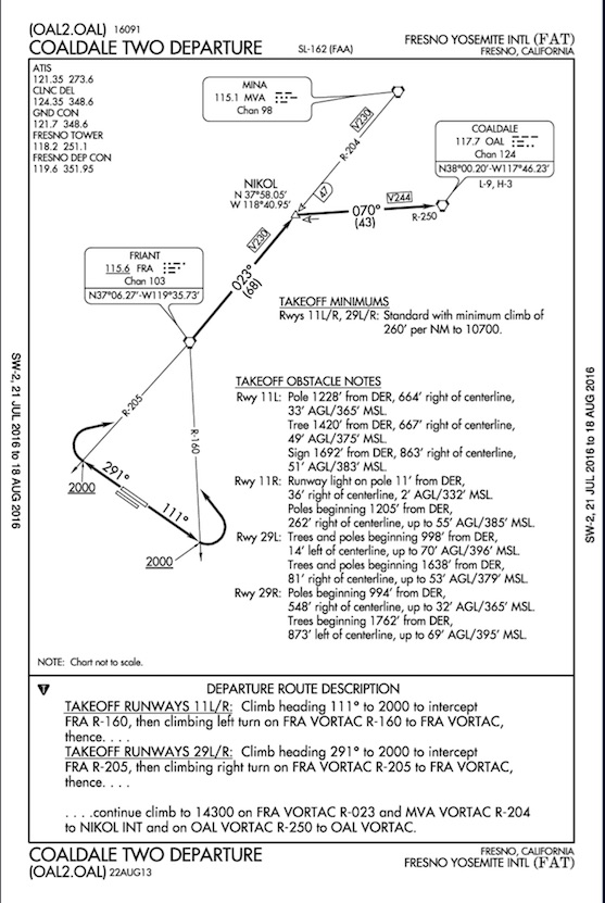
The first is the Jeppesen plate for the Coaldale Departure out of Fresno, CA. The second is the FAA’s version.
Difference #1: Top of the Plate
You will notice the chart numbers are different. Each organization uses its own labeling system.
You can’t move back and forth between them. The “SL-162” and “16091” on the FAA chart below means nothing in the Jeppesen world. Jeppesen chose to call their plate “10-3” although that number is not specifically for that plate. They group their plates in city/metro areas.
The FAA and Jeppesen put their plate revision dates in completely different places as well. For the Jepp plates it’s up top, and for the FAA it’s at the very bottom.
It’s important to be able to locate the chart numbers and revision dates. You need to know if it’s the latest plate. These numbers help you update your charts.
You also need to be on the same plate as your co-pilot when you brief the approach. These numbers will quickly tell you if you and your pilot pulled up different plates. I have done it many times before, and the “10-3” vs “11-2” is a quick way to see you aren’t on the same page.
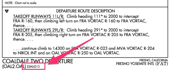
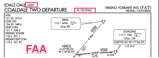
Look at the two snapshots of the FAA chart above compared with the Jeppesen plate below. Jeppesen puts all the information in one place at the top.

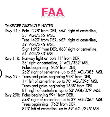
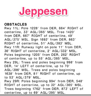
Differences #2: Takeoff Obstacle Notes
The obstacle descriptions look different between the two. I would argue the FAA notes are easier to read because they are clearly broken up between runways. Either way, they are pretty straightforward and I don’t need to say much more about them.
Differences #3: Takeoff Minimums location
TEACHING TANGENT: The Takeoff minimums are extremely important when you are figuring out if you have the climb performance to get out of the airport. Some operations require you to meet the climb gradient on a single engine, but Part 91 is quite liberal. Part 91 doesn’t care if you crap and engine and plow into the side of a mountain because your small twin can’t meet the climb gradient on one engine.
As a rule of thumb, I would start to get worried if you saw anything over 300′ per NM. But I am of the opinion you should meet these gradients with one engine. It’s your life. Do what you like.
Just have a plan if you lose and engine because you will have to get around the obstacles on one engine. You should know the climb performance of your aircraft on one engine in fpm and in ft per NM.
Memorize those numbers. It will help you quickly identify departure procedures with difficult takeoff minimums.
Enough of my lecturing.
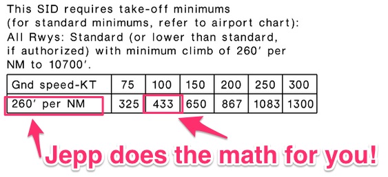
The biggest difference, besides the location, is the Jepp chart converts climb gradient into a useable number. Notice on the Jepp chart, 260′ per NM translates into 433 feet per min climb on your VSI at 100 knots.
With the FAA charts you are on your own to do the math.
Check it out:

Differences #4: Departure description
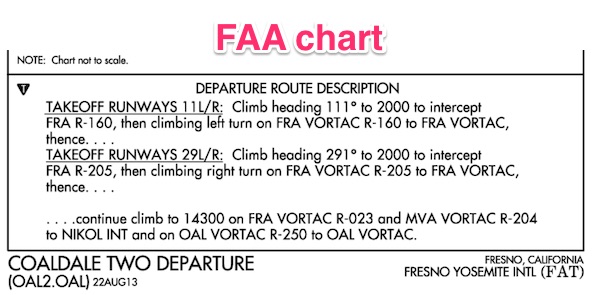
The departure initial climb and routing descriptions are perhaps the most important sections besides the takeoff minimums.
Both are located at the bottom of their respective chart. Or, as often in the case with FAA charts, they are on a completely separate page.
Take a minute to look at the differences. Jeppesen breaks out the route from the initial climb whereas the FAA chart uses continuation dots to indicate the “routing” part.
Check it out…a picture is worth a thousand words.

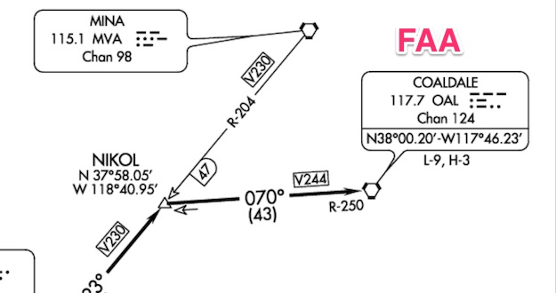
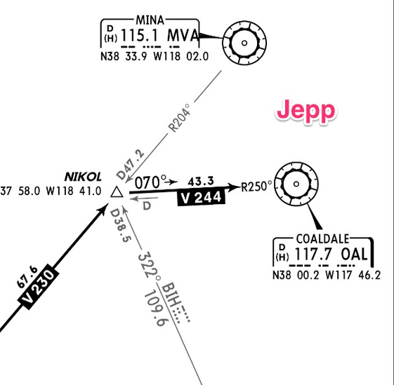
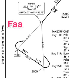
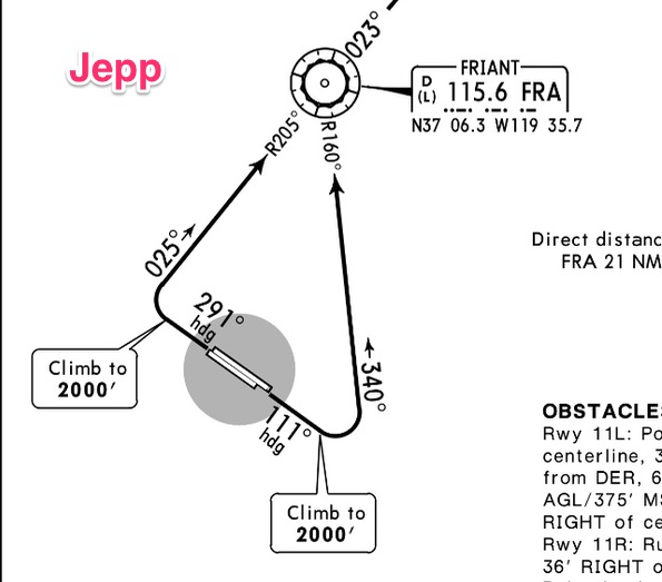
Differences #5: Graphics
The last major difference between the charts are the graphics and symbols used by each organization.
Neither is better than the other necessarily. It’s just a matter of getting used to one or the other.
Whew! That’s it.
Do you want weekly tips and resources?
Subscribe to keep learning.